How to Translate Your Brand Strategy into Visual Designs

You have a business plan and a well-developed brand strategy. So what now?
How do you translate those documents into visuals for your business? How is that related to your logo, website? You want your business to look smart, knowledgeable, clean, professional or whatever that might be… but how do you actually do that?
Start with Your Target
To translate your strategy into visuals, you need to start from knowing your ideal client really well.
Not just in a sense of what gender they are, where they live and what their salaries are. Not just demographics but more importantly their psychographics. What do they like, what are their interests, what do they care about?
If you are wondering how is this now related to translating the brand strategy into visuals, well – who are you going to create visuals for? You need to dive deep into what they would like to see. Everything you create and do with your brand and business is for your target.
Especially your visuals. A logo, business cards, and functional website will attract your target to your business and help you grow your revenue. So it’s important to know your target and spend some time trying to get into their heads and learn why they do what they do. Is your business the solution to their problem?
To help you translate brand strategy into visual designs, you can download this free-mini workbook where I show you how to identify your brand attributes and choose the colors for your health and wellness brand:
Brand Attributes & Brand Voice
A brand is like a person, and it can have characteristics like people do. Your brand can be fun, friendly, relaxed. It can be whatever you want people to think about your brand and your business in general. Brand attributes always get developed in the process of creating brand strategy, and they are based on your target.
How would you describe your target? Imagine a person buying your product or services. Describe that person. In my branding business that is someone who is busy, frustrated with day to day tasks in their business, don’t know how to scale revenue, visual branding is simply off, and so on.
Does that mean my branding should look busy, with too much information? No! Quite the opposite. I want my target to feel relaxed, satisfied, to trust me and to feel safe. So, I take all the opposite and actually turn the negative into positive. To learn my process on how to do this, check out my Ideal Client Blueprint:

That way I communicate “Do you feel stressed? Your business is stuck? Let me help you by saving your time and actually growing your business.” So, what you need to do is to find attributes for your target, and then how you want your business to sound to that target.
Examples of some attributes of your target: negative, insecure, stressed, sad, boring. And then just turn that into positive and make your brand look: positive, confident, relaxed, happy, fun… Here is an amazing list of attributes.
Your attributes are the base for your designs. Attributes are what’s going to be translated into visuals. You will still need a designer to help you but this is what your designer will need in order to create a brand that will attract your target audience.
Brand Reflection
If one of your words to describe your brand was “fun,” your visuals would need to look fun. So what looks fun? Can you name three things that feel fun when you look at them? This is a brainstorming process, and your designer should be able to help you come up with ideas and examples.
What comes to my mind as fun is a birthday party, balloons, amusement park, playing games with friends – with that said, fun is something colorful, something busy, something interesting. To capture this element of fun in your visual identity, your designs could be multicolored, and you could use creative fonts and interesting images that capture attention.

Think about the voice of your brand as well. How do you want your brand to sound to others? If your voice is “friendly,” you will need to include images that demonstrate friendliness to your target since that is the way your brand speaks to them.
What would be friendly? Maybe photos of two people meeting for coffee or going to happy hours, a family during lunch, or people smiling.
Think about how bigger brands demonstrate their brand voice through their visuals. Apple sounds innovative because their branding looks innovative, it sounds modern because their visuals look modern, it sounds knowledgeable because their designs look cutting-edge, etc.
Then in terms of emotions, if you want potential buyers to feel relaxed how can you make them feel relaxed through your visuals?
Think about how spas make their customers feel relaxed: they use soft colors, they include photos of people who are enjoying and resting, and their language is serene and peaceful. Here is an ebook I created to help you see how brands use colors and logos to evoke emotions in customers:
Mind Maps
Mind maps are amazing in getting quick ideas and expanding on the words and meanings. You can do a quick exercise of mind mapping too. To start the mind mapping process, you will put the name of your company in the center of a piece of paper.
Then, surround that word (the name of your company) with 6-10 words that are close to it. Consider the specialty, services, nature of your business, brand voice, maybe location – whatever comes to your mind first. These words need to be your first thoughts, so don’t spend too much time on it.
Then you can expand on each word. For example, on my mind map I would have Aventive Studio, and then my first few words around that would be brand, business, design, strategy, creative, strong, and innovative. Next, I would expand and add more words around each one.
For example, around business I would write startup, growth, scalability, careful, money, and clever. Then I would expand upon each of these words and tried to come up with objects that I can visually use. The word growth would have words around it such as flower (plant), city, money, or crowd – everything that is growing, that reminds me of “a lot” or “more and more.”
I could use a video of a growing flower for my website (just a quick example) and that would be a way to translate from my strategy into visuals. A designer would put more thoughts and research into this, and they would probably start with a logo design first– so perhaps the logo would include a flower to symbolize growth. But, the point is that designs would expend from your words to visuals that mean the same thing just presented differently.
To have visuals that reflect your business, you need to have the brand strategy developed first. A brand strategist would deliver to you a document with target profiles, brand attributes, brand voice, brand goals…
From there you can start your brainstorming session on how your visuals need to “sound” to others and what others would like to hear = see. What would make them comfortable and trusting enough to purchase from you?

At Aventive Studio, we help health & wellness businesses create powerful brand identities that attract their ideal customers and increase their sales. You can find our full suite of brand strategy and design services here.
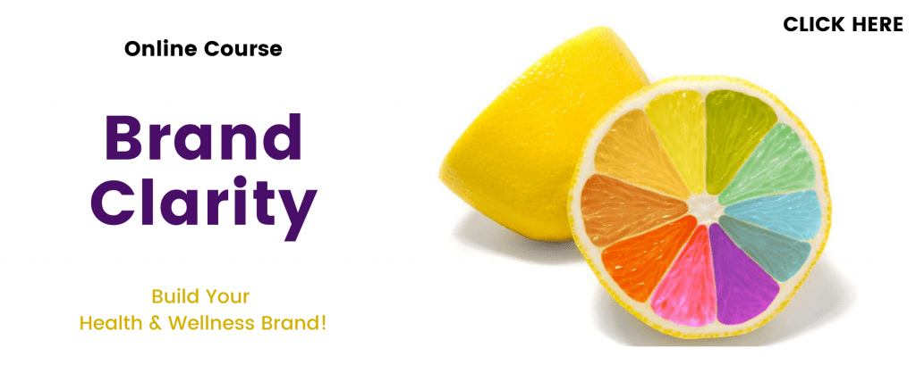
We also offer a variety of resources to help you build your own brand, including the Brand Clarity online course and the book BrandFix: A Brand Strategy Guide for Busy Entrepreneurs which was written by our CEO Kady Sandel.
Ready to position your brand apart from the rest? Contact us here to schedule a call with our team.