8 Best Cosmetic Packaging Design Examples

The cosmetic industry is thriving more than ever before. The beauty business is one such cultural domain that radiates outward. Researchers predict that the worldwide cosmetic packaging market will soon be worth $31.8 billion.
Although cosmetics have always been considered a staple of women, modern times have shown that anyone can benefit from them. We carry them in our bags and backpacks, use them in our bathrooms and keep them on our dressers and nightstands; cosmetics have become an integral part of our daily lives.
More and more organizations are entering the market and using novel approaches to stand apart from the crowd. Therefore, if you want your products to stand out in this industry, you need to invest in cosmetic packaging design that is both effective and attractive.
The top examples of cosmetics container designs are compiled in this post for your perusal and inspiration.
At Aventive Studio, we create memorable cosmetic packaging designs to help you sell more skincare, beauty, and wellness products! View our full suite of branding, packaging design, & strategy services here.
1. ColourPop
There is a fine line between modern and minimalism, elegance and dreaminess, and ColourPop walks it. There’s something regal and fantastic about how their eyeshadow palettes and lipstick tubes are designed.
Each product’s packaging features unique color combinations and artistic representations of the product inside. Some have a smooth, silky matte finish with charming motifs, while others are glittery, shiny, and glamorous. Simple, direct, and minimalist designs exist as well.
A lot is going on, which may be both interesting and disorienting. In contrast, using ColourPop is a breeze. There is a unique style and concept behind each parcel. Each box is designed to induce a specific frame of mind, like its corresponding product.
Some goods are designed for a wild night on the town, while others are more understated and suited to a quiet morning at home. Products like this are effective at selling themselves because of the attention to detail and individuality put into their designs.
It’s a novel approach to cosmetics packaging that gives each item its character. The only unifying factor amongst these items is the bold, sans-serif typeface and the ColourPop wordmark. The product, however, is amazing.
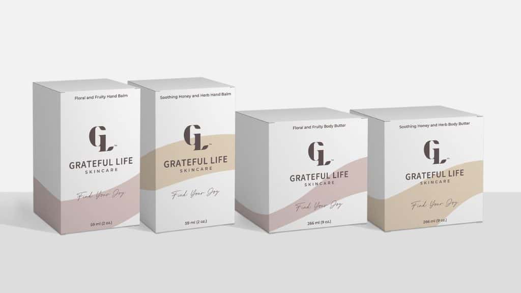
2. Grateful Life Skincare
With all-natural ingredients, including Prickly Pear Seed Oil and Jojoba Oil, Grateful Life Skincare provides luxurious skin care products for the face, body, and hands. Each of their items has been carefully developed to alleviate the signs of aging like skin dullness, fine lines, wrinkles, and discoloration.
With the help of the client’s ideal client persona profile, brand attributes definition, and messaging, Aventive Studio created a comprehensive brand strategy and long-term plan for expansion.
Packaging and visual elements (such as logos and color palettes) were developed in accordance with the brand’s strategy (labels & boxes). In addition to website design and development, our Aventive Studio team also provided copywriting for their new website.
You can view the full case study of the Grateful Life Skincare brand strategy, website design, & packaging design project here.
3. Waterbody

As the name implies, Waterbody is a skincare line motivated by the watery terrain of Southeast Alaska. Products are made using all-natural components from the local mossy forests, moist muskegs, and rocky, barnacle-covered coastlines.
In order to convey this idea through her branding and packaging, founder Angie collaborated with LA-based designer Kati Forner. And the result she achieved is stunning in its beauty. The logo and color scheme is calming and natural, evoking thoughts of the ocean and the sky.
Original and opulent, the copper foil writing emblazoned on the front of each tube also denotes authority, letting the buyer know that this is a company that cares.
The cardboard tube’s design slides open to expose the special recipe inside, creating an element of pleasant surprise and delight for the consumer.
4. Glossier

The cosmetics from Glossier come in minimalistic yet stylish packaging. The cosmetics company was ahead in adopting the minimalist aesthetic, and it shows.
The beauty and calmness of these designs come from their brand simplicity, subtlety, and sanctity. An abundance of white space and clean, straightforward black text characterize these cosmetics. There’s a luster and a brilliance that grabs your attention and keeps you coming back for more.
Minimalist design is characterized by its clean lines, bold color palette, and streamlined aesthetic. These Glossier layouts are a beautiful demonstration of elegance and clarity in design.
There has been a recent and a rather sudden rise in the popularity of minimalist cosmetic packaging design companies like CoverGirl and Milk.
This cosmetics box is top-notch because it features such appealing design elements as a crisp white background, bold but uncluttered writing, and refined use of shine.
5. Beauty by Code

Beauty by Code products combine American ingenuity with French finesse and Galenic knowledge of the beauty industry. BbC created reliable solutions with an emphasis on ethically sourced, specialized components by fusing the greatest European skincare formulations with a drive to tackle actual concerns for women.
The team at Beauty by Code set out to create novel skincare products that would grab customers’ attention in a matter of milliseconds. BbC needed a brand strategy and comprehensive brand plan to achieve this objective before any visuals could be generated.
You can view the full branding case study for the project here.
As part of the brand strategy process, Aventive Studio identified the profile of the ideal customer for BbC skincare products and determined where best to place the brand in the marketplace. We developed Beauty by Code’s overarching goals, principles, and tone of voice, and documented these brand assets in the company’s brand guidelines.
The visual elements of the Beauty By Code brand were designed using our meticulously thought-out strategy. We created a logo design, labels, packaging, styled photography examples, and a streamlined e-commerce website after determining the brand’s intended tone and feel.
We researched the market to produce visual and web designs that specifically stand out from the crowd in terms of originality, differentiation, elegance, and prominence.
If your cosmetics company is ready to scale to the next level and make more product sales, contact Aventive Studio here. We can help you create a brand strategy and visual identity that stands out from the crowd and attracts the right customers!
6. SOFI Cosmetics

SOFI, a cosmetics company established in Serbia, is run by a family and is known for its premium, naturally derived products manufactured by hand.
Natural soaps, bath bombs, lip balms, aromatic salt baths, face creams, hand creams, and body oils are all available. Their packaging relies on the “power of plants” and “respect the environment” themes and is basic yet exquisite thanks to botanical designs.
Belgrade-based art director Milica Panteli created the piece, and she remarked that it came as no surprise that the company had opted to use design tactics rather than traditional marketing to spread the word about its product.
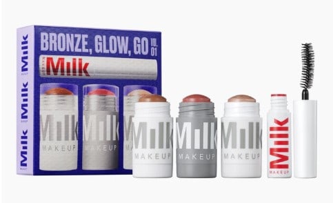
7. Milk Makeup
Milk Makeup’s cosmetics come in striking, futuristic packaging. Most of the packaging for this brand is designed in a shiny silver tone, which draws the eye and stands out.
Together with the clean, white sans-serif typeface, this makes for a stunning cosmetics box. Milk Makeup’s aesthetic is spare and uncluttered. The same packaging design and layout are used for lipstick and face masks.
This cosmetics line gives you creative freedom in how you use it by emphasizing white space, clear typeface, and few words.
Milk Makeup is your brand if you want makeup from a company that knows what it’s doing and doesn’t waste your time with flashy packaging.
This intriguing packaging is a great example of how minimalism can have a significant impact, transforming a mundane product into something worthy of being showcased.
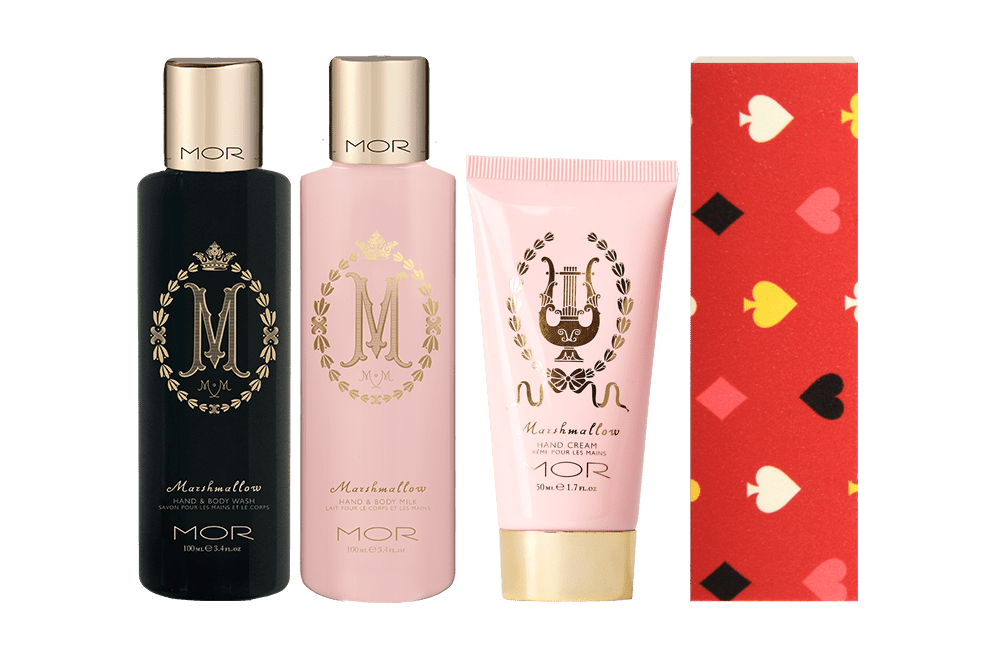
8. Mor
Mor’s beautiful and classy design for cosmetics packaging. The artwork decorating these boxes, perfume bottles, lip balms, and lotions is set against a backdrop of soft pinks and gentle whites.
Mor’s packaging takes a more conventional approach, emphasizing class and elegance with its artwork, logo, and color scheme.
All Mor merchandise proudly displays the company’s emblem, which consists of a huge M written in a decorative, curly typeface and cast in a regal gold tone. The refinement and opulence of the M’s design are echoed by the golden wreath that frames it.
Whether we’re talking about the logo or the packaging, there’s no denying the presence of a floral motif. Many of the items have floral patterns and designs on their packaging, with earthy tones like rich greens, purples, and pinks.
These blooms are stunning and bring a new level of grandeur to the whole arrangement. A beautiful and elegant cosmetics package was created by Mor. The very fact that they don’t look like makeup is part of their appeal.

Final Thoughts
At times, it might get challenging to create an active and dedicated fan base for your brand. Customers nowadays are more selective than ever before, and competition is strong.
But whether you’re a traditional cosmetics company or an online retailer, your beauty product packaging design is the initial point of contact with your customers.
When it comes to selling your cosmetics, having a genuine design for the box can make all the difference. It will attract clients’ attention and help your cosmetics move off the shelf and into their shopping carts.
Here at Aventive Studio, we curate unique approaches to brand development that will help your skincare business achieve the success you’ve always dreamed of.
Contact us to set up a chat with our creative director to discuss how we can assist you in increasing the visibility of your cosmetic brand!


