Why Most Skincare Brands Look Cheap (And What Actually Makes One Look Premium)
Most skincare brands do not lose because of their formula. They lose because their skincare branding looks cheaper than their product is.
This is the part founders do not want to hear. You spent eighteen months on the formula. You found the right manufacturer. You hit the price point. You launched. And then nothing happened.
It is not the formula. It is what people see before they ever read your ingredient list. The skincare brand identity is doing the selling, or the losing, before the product gets a chance.
What makes a skincare brand look cheap?
A skincare brand looks cheap when the visual identity does not match the quality of the formula inside. Cheap is not a price point. It is a gap between what the product is and what the brand communicates. That gap shows up in stock fonts, generic packaging, inconsistent design, and photography that looks unprofessional.
Drunk Elephant is not cheap. The Ordinary is not cheap. Both have specific price points and specific design choices that match. Cheap is when the skincare brand identity does not match the quality of what is inside the bottle.
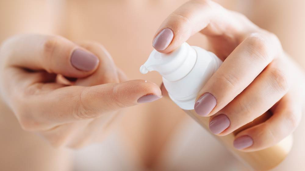
Cheap shows up in repeating patterns. Stock fonts that ship free with every Shopify theme. Logo files that look like they were designed in twenty minutes. Color palettes pulled from a Pinterest board with no point of view. Skincare packaging design that feels like every other white-label tube on Amazon. Photography taken on a folding table in someone’s apartment.
Customers cannot articulate this. They will not say your skincare brand looks cheap. They will just scroll past you. Or pick up the bottle and put it back down. Or click off your website in eight seconds without buying anything.
They do not need to be design experts to feel it. The body knows. Premium feels different. So does cheap.
Why does brand visual identity matter more than the product?
Brand visual identity does not matter more than the product. It matters before the product. A customer cannot test a serum through a screen. The only thing they can evaluate before deciding to buy is how the skincare brand looks.
A customer cannot taste, smell, or feel a serum through a screen. They cannot test the formula on their skin in your Instagram feed. The only thing they can evaluate, in the seconds before they decide whether you are worth their attention, is how you look.
Your skincare brand is a proxy for your product. If the brand looks like a $14 drugstore find, that is what the customer will pay. If the brand looks like a $68 ritual, that is what they will pay. The formula inside the bottle is identical in both scenarios. The price point the market accepts is not.
Founders fight this. They believe the work should speak for itself. The work cannot speak. The brand speaks for it.
What does a premium skincare brand actually look like?
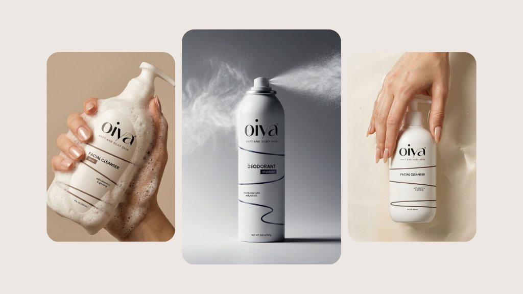
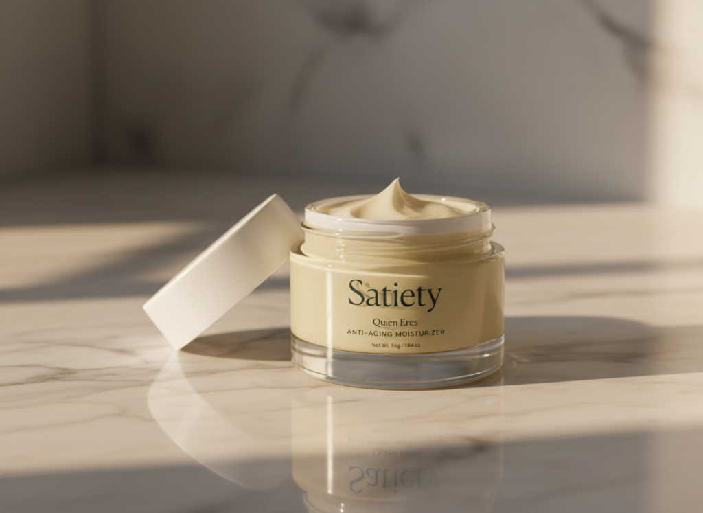
A premium skincare brand is built on three things: restraint, consistency, and intention. Premium brands use less, hold every touchpoint to the same visual standard, and make every design choice with a clear reason behind it.
Premium is not a style. It is a set of decisions, made consistently, that signal care across every touchpoint of the skincare brand.
Restraint is the first one. Premium skincare brands use less. Less color. Less copy. Less decoration. Look at any luxury skincare brand on a shelf and the thing they all share is space. White space. Quiet. Confidence in not having to prove themselves.
Cheap brands are loud. They use seven fonts on a label. They cram every claim and certification onto the front of the box. They are afraid that if they do not say everything, the customer will not buy. Premium brands say less and trust that the right customer will lean in.
Consistency is the second. Every touchpoint feels like the same brand. The logo on the bottle, the typography on the website, the photography on Instagram, the color of the shipping box. Same world. Same rules. Same point of view.
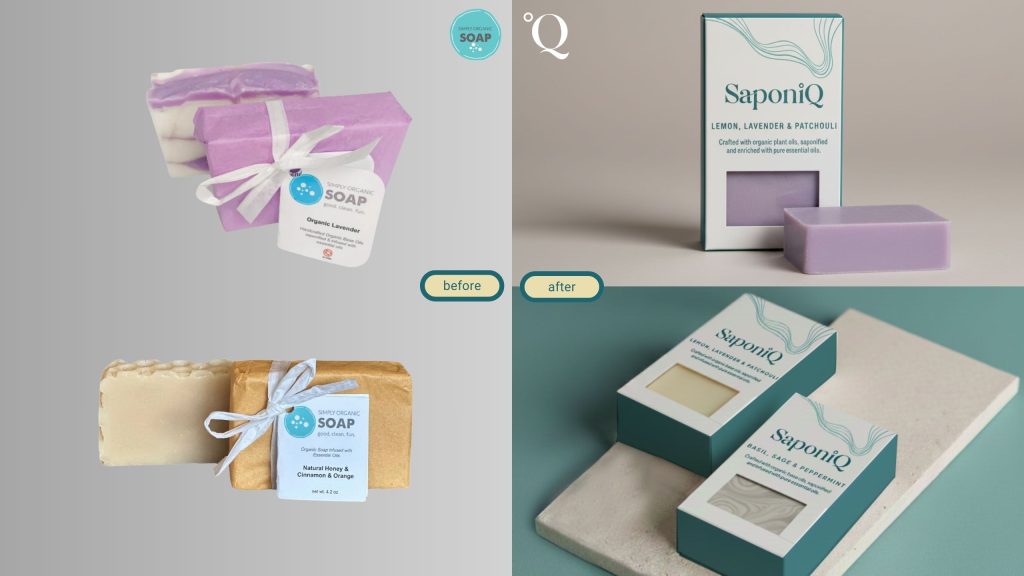
For example, we did exactly that in the Grateful Life Skincare project, where every touchpoint from the primary packaging to the website to the social grid was built from a single visual system.
Inconsistency tells the customer no one is in charge of the brand. That signal travels. If no one is in charge of the brand, who is in charge of the formula? Who is in charge of quality control? Who is in charge of the customer experience?
Intention is the third. Every choice has a reason. The font is not just a font. It carries a feeling. The color is not just a color. It positions you in the market. The shape of the bottle is not just a shape. It tells the customer something about who they become when they use it.
Customers feel intention even when they cannot name it. They will say a brand feels right. What they mean is every choice was made with the customer in mind.
Is a premium skincare brand more expensive to build?
Yes, premium skincare branding is more expensive than cheap branding. But the cost is not in the design fee. It is in the senior decision-making required to keep hundreds of brand decisions consistent across every touchpoint.
A premium skincare brand identity is not built by spending more on a logo. It is built by working with people who know how to make hundreds of decisions consistently across every touchpoint. That is the cost. Not the design fee. The decision-making.
The cheaper version of this work exists. Fiverr, Canva templates, junior freelancers, generic agencies that work across every category. That work is fast and inexpensive. It also produces brands that look like every other brand in the same category. That is the trade.
Premium skincare branding is a long game. It is built to scale, hold up across thousands of impressions, survive a category pivot, and stay relevant when trends move. The cheaper version is built for launch. It does not hold up past month six.
How do I know if my skincare brand is hurting my sales?
Three signs your skincare brand is hurting your sales: traffic without conversion, average order value below your hero product price, and constantly competing on price instead of position. If any of these are true, the brand is the lever that needs to move.
First, you have traffic but the conversion rate is below two percent. People are finding you. They are not buying. The product page is not the problem. The trust is not there before they get to the product page.
Second, your average order value is lower than the price of your hero product. Customers are picking the cheapest item, hesitating to add anything else, and leaving. They are not confident enough in the brand to buy more.
Third, you are competing on price instead of position. Every conversation with a buyer or a partner ends with a discount request. The skincare brand is not communicating premium. So the market is treating you like a commodity.
If any of these are true, the skincare brand is the lever. Not more ads. Not better copy. The brand.
What is the next step?
Stop comparing your skincare brand to the cheapest competitors in your category. Compare it to the brands you want to sit next to on a Sephora shelf or a Credo countertop or a Goop edit. Look at the gap. That gap is the work.
This is what we do at Aventive Studio. We build skincare brands that look like the formula inside the bottle. Premium positioning, brand strategy, packaging design, and websites built to convert.
If your skincare brand is not pulling its weight, see how we work.