Psychology of colors, shapes and placements – visual branding

Design doesn’t just involve creating inspirational art, but also knowing how people will react to it.
Design is a universal communication, which means that everyone in the world who sees the design should understand it. Everyone in the world needs to feel the same way when looking at one design.
If you’re looking for design ideas to inspire your health and wellness business, I made this free ebook of over 20 curated logos and visual branding examples! Snag your copy here:
Psychology of colors
Different colors have different meanings. What color do you think of when you hear the word “money”? How about “love”? One is a noun – object, one is a verb – feeling, and for both words we have certain specific colors that pop into our minds.
If you want people to think about money or love when they interact with your company, you should consider using shades of green or red, respectively, to make that connection in their minds.
Colors usually have several different meanings or associations in color psychology – for example, green doesn’t always indicate money, but that specific shade of green does. If you use bright or light green in your branding you might create the feelings of “fresh,” “healthy,” and “new”.
Below you can see some common meanings of colors:
Red: energy, action, passion, powerful, strong, determined
Green: growth, calm, natural, adaptable, relaxed, stability, harmony, balance
Blue: loyalty, trust, reliability, responsibility, authority, peaceful, idealistic
Yellow: optimistic, enthusiasm, fun, creativity, challenging, logic
Orange: sociable, optimistic, independent, adventurous, informal, cheerful
Pink: romantic, love, understanding, sweetness, feminine, intuitive energy, hope, warmth
Brown: down-to-earth, approachable, protective, strength, honesty, quality, structures, stable, friendly
Gold: success, self-worth, positive, optimistic, love, wisdom, luxury, charisma, positive
Purple: creative, selfless, humanitarian, mystery, fantasy, future, inventive, unlimited
Gray: reliable, neutral, mature, intelligent, classic, solid, stable, calming, elegant, formal, dependable
White: cleanliness, complete, simplicity, equality, open, new, neat
Black: strong, protection, formal, sophisticated, comfort, contained
So, what colors represent your business?

Psychology of shapes
Shapes can show customers a lot about your business, and the shapes you use will reflect whether your business is artistic, friendly, powerful, etc. Just like colors, shapes speak to customers. Each shape has its own meaning and influences our mind and reactions differently.
What shape do you think of when you hear the word “building”? I assume it’s a square or rectangle, and not a circle. Squares, rectangles, and triangles are the most-used shapes and we see them around us all the time. Our computers and monitors, cellphones, books, furniture, doors, and so on use square and rectangular shapes.
Straight lines and angles give a sense of trust, security, reliability, seriousness. Now, if your business has these attributes, your logo and other design elements will have more squares than round shapes. It’s that easy, and it all depends on what will attract your ideal client – which we cover in our comprehensive Ideal Client Blueprint.

Circles, on the other hand, are more related to Sun, Earth, rings etc. They usually represent ideas of completion, wholeness and harmony.
Circles are also more feminine than masculine (like squares) and can suggest movements – think about balls, wheels, and watches. If your business is selling a lotion for women, your designs will most likely be closer to circular ones than squares and triangles.
Your task is to picture your ideal client and imagine what would attract them more: something soft, round, gentle, and smooth, or something strong, manly, rough, and firm. Your logo, website, flyers, and other materials should reflect that feeling as well. You designs should have either soft or strong edges, loud (big) or quiet (small) circles or squares.
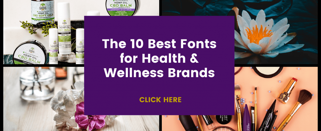
The fonts for your brand will reflect the shapes you choose, which is why selecting the right fonts is so important. We created a useful guide that includes font recommendations (including exact font pairings!) for health and wellness brands, and you can click here to get your copy.
Psychology of placement
Placement is related to what a human eye catches first. If we take a website as an example – when someone lands on your home page, they need to know what to do next.
If you scatter a lot of images, texts, and call-to-action buttons randomly on your website, your conversation rate will be lower because the human eye would just scan the website and maybe even completely overlook the button.
Your designs need to grab the consumer’s attention. Everything needs to be well-designed when it comes to placements.
With this particular example, professional website designers actually make sketches in black and white, only using geometric shapes and lines to make a template and decide deciding where to put a photo, text, header etc. These sketches are basically just empty squares with words that describe what will eventually fill them in.
By knowing and using the psychology of colors, shapes, and placement, you can influence the first impression that customers have of your brand. I don’t recommend spending hours diving into the world of brand psychology — unless you really want to 😊
But knowing the basic attributes of what each color, shape, and placement means can help you get started and ensure that you’re truly communicating your brand attributes to your customers.
Do you want more actionable branding tips for your business? Download our free branding workbook here to make your brand stand out from the crowd and attract more customers: