Why Founders Pick the Wrong Colors for Their Skincare Brand
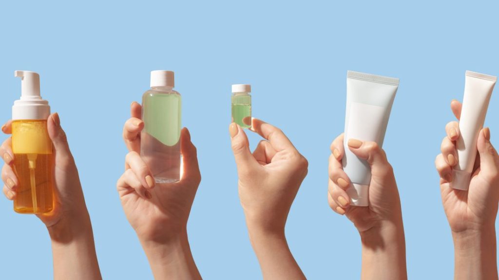
Color is the first thing a customer sees and the fastest signal a skincare brand sends. It happens before the customer reads a word. Get the color right and the brand starts the conversation correctly. Get it wrong and the customer is confused before any other element of the brand has a chance.
Most skincare founders pick their brand colors the wrong way. Not because they have bad taste. Because they pick from the wrong reference point.
Here is why that happens, what it costs, and how to choose colors that actually do the work.
Why do founders pick the wrong colors for their skincare brand?
Most skincare founders pick brand colors based on personal taste instead of customer trust. They choose what they like, what feels current, or what looks pretty in a Pinterest mood board. The customer does not care what the founder likes. The customer reads color as a signal of what kind of product this is and whether it is worth their money.
Founders are with the brand every day. They see it on their laptop, their phone, their packaging samples, their Instagram. After a few months, they want a brand they enjoy looking at. That instinct is human, and it is also the wrong filter.
The customer sees the brand for three seconds before deciding whether to scroll past or click in. The color in those three seconds is doing one job: telling the customer what kind of brand this is and whether to trust it. The founder’s taste is irrelevant to that job.
This is the most common color mistake in skincare. Founders pick colors that feel good to them. The customer reads those colors as confused, off-category, or off-tier, and the brand never gets the chance to make its case.
What do colors actually signal in skincare?
In skincare, white and off-white signal purity and clinical credibility. Green signals natural and botanical. Black signals luxury and authority. Blue signals trust and science. Pink and peach signal approachable and feminine. Each color carries category meaning the customer reads instantly, whether the founder intends it or not.
Color is a shortcut. Customers do not analyze it. They feel it. And what they feel is shaped by every other skincare brand they have seen in their lifetime. Color cannot escape its category meaning, no matter how the founder wants to use it.
White communicates purity, cleanliness, and safety. It works for clinical lines, dermatologist-style brands, and clean beauty. Green communicates natural, plant-based, and sustainable. It works for botanical lines but reads cliché if the brand has nothing else backing it up. Black communicates luxury and authority. It works at higher price points and for serious actives. Blue communicates trust, science, and calm. It works for clinical positioning. Pink and peach communicate approachable, gentle, and feminine. They work for entry-level skincare and gentle formulations.
These meanings are not opinions. They are what your customer brings to the page before you say anything. Working with them is how brands get understood quickly. Working against them costs time you do not have.
What is the most common color mistake in skincare branding?
The most common color mistake in skincare branding is using a color that does not match the price point. A natural-looking earthy palette at a $120 price reads as overpriced. A clinical white-and-blue palette at a $25 price reads as overdesigned. The color has to confirm the price the customer is being asked to pay.
Price is read through color before it is read through the price tag. The customer looks at the brand, develops an expectation of what it should cost, then checks the actual price. If the two match, the customer trusts. If they do not, the customer hesitates.
A premium brand in low-tier colors loses sales because the customer assumes the price is too high. A low-tier brand in premium colors loses sales because the customer assumes the brand is pretentious. Both fail for the same reason — the color did not confirm the price.
This is the mistake that costs the most and shows up the least in founder conversations. Founders ask whether the color is pretty. They should ask whether the color confirms the price.
How many colors should a skincare brand use?
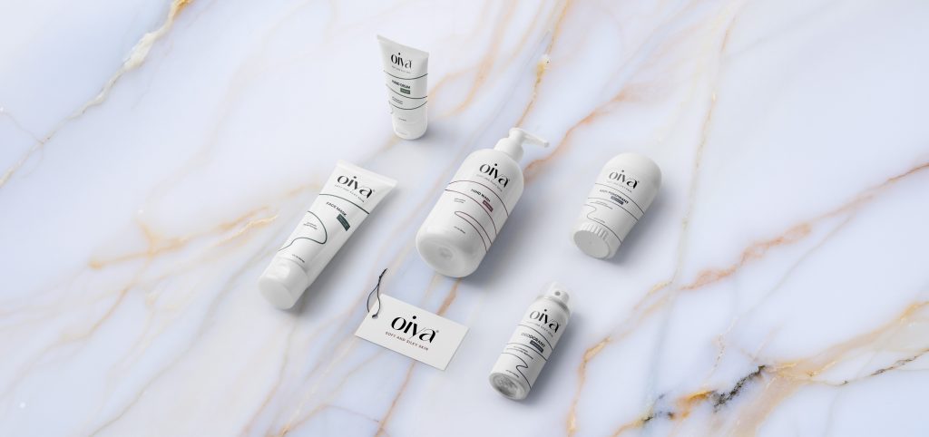
A skincare brand should use a primary palette of two or three colors plus a small secondary palette for accents and supporting elements. More than five colors in active use creates visual noise, dilutes the brand, and makes the work harder to extend across new SKUs without losing cohesion.
Premium skincare brands use less. The whole brand can usually be reduced to a primary color, a secondary color, and a neutral. Everything else is supporting. The restraint is what makes the brand recognizable.
Brands that use too many colors look unsettled. The customer cannot tell what the brand is about because the brand cannot tell either. A skincare line with seven active brand colors is a line that has not made the hard decisions yet.
Restraint is also functional. New SKUs launch. Packaging extends. Campaigns happen. A tight color system stretches cleanly. A loose one breaks the moment the brand has to grow.

How do I pick the right colors for my skincare brand?
Pick skincare brand colors based on three filters: who the customer is, what tier the product sits at, and what positioning the brand is claiming. Personal taste is the last filter, not the first. Colors that pass all three filters will feel right to the customer even if they are not the founder’s first instinct.
Start with the customer. Who buys this product. What tier of skincare do they already own. What other brands sit in their bathroom. The colors of those other brands tell you the visual world your customer already lives in.
Then layer the price tier. A $30 product needs colors that read accessible and trustworthy. A $90 product needs colors that read premium and considered. The two do not use the same palette.
Then check the positioning. A clinical brand needs different colors than a natural brand, even if both target the same customer at the same price. The positioning is the third filter.
Only after those three filters does personal taste enter. And by then, taste is not picking the colors — it is choosing between two or three options that all pass the first three filters. That is the right way to use the founder’s eye.
What is the next step?
If your skincare brand colors feel off but you cannot say why, run them through the three filters: customer, tier, positioning. The mismatch will reveal itself fast.
This is part of what we do at Aventive Studio. Skincare brand color systems built around customer trust, not founder taste. See how we work.