How Packaging Design Affects Skincare Sales
In skincare, packaging is the silent salesperson. Before a customer reads an ingredient list, scrolls a product page, or watches a founder talk about their formula, they have already made a decision based on what the packaging looks like. That decision is faster than any rational evaluation, and it is harder to change once it is made.
This is why skincare packaging design is not decoration. It is the part of the brand that does the most work in the shortest amount of time. The formula matters. The story matters. But neither one gets a chance if the packaging does not earn it.
Here is exactly how skincare packaging design affects sales, and why most brands underestimate it until it is too late.
Why does packaging design matter so much in skincare?
Skincare packaging design matters because skincare is the rare category where the customer cannot evaluate the product before buying it. Results take weeks. Texture and scent are invisible online. The packaging is the only signal of quality the customer has at the moment of decision. So the packaging is doing the selling.
Most categories let the customer evaluate the product directly. Food has taste. Apparel has fit. Tech has features. Skincare has a promise. The customer cannot try the serum, see the results, or feel the texture in the seconds before they decide whether to buy.
That gap is filled by the packaging. The bottle, the carton, the label, the weight in the hand, the finish on the cap. Each one of those signals tells the customer something about whether the product is worth the price and worth the trust.
When the packaging signals premium, customers extend trust before they have a single piece of evidence. When the packaging signals cheap, no amount of clinical claim or founder story will overcome it. The packaging is making the case the founder cannot be there to make.
How does packaging affect first impressions in skincare?
Packaging shapes the first impression of a skincare brand within seconds. Customers form a judgment about quality, price tier, and trust before they read a single word. That impression sets the ceiling on what the customer is willing to pay and how much credibility the brand starts with.
The first impression is not optional. Every customer makes one, every time. Whether the brand is on a Sephora shelf, in an Instagram ad, or on a friend’s bathroom counter, the packaging triggers a snap judgment about what kind of product this is.
That snap judgment includes price. A heavy glass jar with restrained typography reads as $85 even before the customer sees the price. A flimsy plastic tube with crowded copy reads as $12 even if the actual price is $40. The packaging sets the price the customer expects to pay, and any mismatch creates hesitation.
It also includes trust. Premium-feeling packaging makes the brand seem established, professional, and worth the risk. Cheap-feeling packaging makes the customer wonder what corners were cut on the formula. The customer cannot articulate this. They just put the bottle back down.
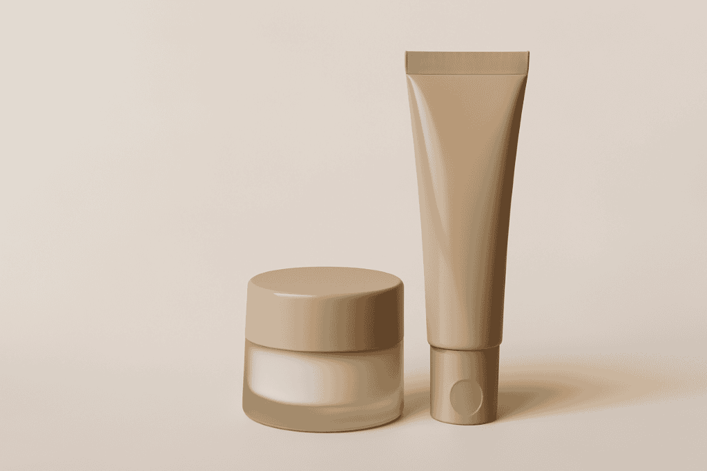
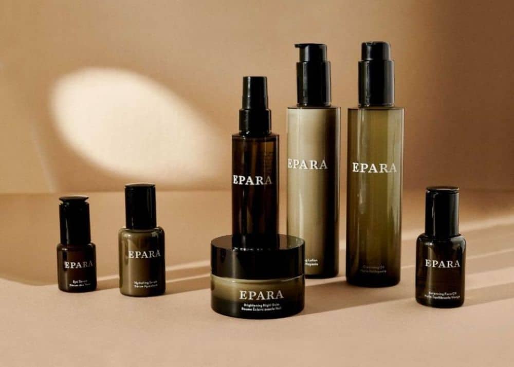
What does premium skincare packaging look like?
Premium skincare packaging looks intentional. Every choice has a reason: the bottle shape, the weight of the glass, the finish on the cap, the typography on the label. Premium packaging uses restraint, communicates with white space, and feels different in the hand than mass-market products.
Restraint is the first signal of premium. The label says less. The colors are fewer. The decoration is minimal. There is white space because the brand does not feel the need to prove itself with every square inch.
Weight and material are the second. Glass over plastic when the price point supports it. Heavier components over lighter ones. Matte over glossy when the brand is positioning quietly. These choices are felt in the hand before the customer can name them.
Detail is the third. The typography is tight. The alignment is exact. The print quality is clean. The cap closes with a satisfying weight. None of these are individually dramatic. Together, they communicate that someone cared enough to get every detail right, which is exactly what a customer wants to believe about the formula too.

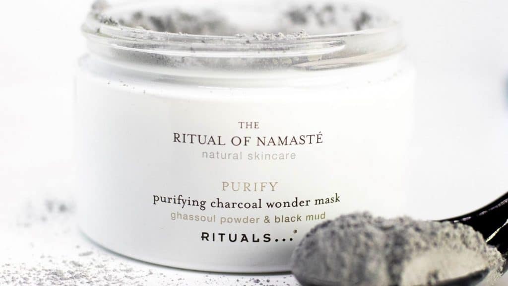
How does color affect skincare packaging design?
Color in skincare packaging design carries specific meaning that customers read instantly. White signals purity and clinical credibility. Green signals natural and botanical. Black signals luxury and authority. Blue signals trust and science. The wrong color creates confusion about what the brand stands for.
Color is the fastest message a skincare brand sends. It happens before the customer reads a word. Get the color right and the brand starts the conversation correctly. Get it wrong and the customer is confused before any other signal has a chance.
White and off-white communicate purity and safety. They work for clinical brands and clean beauty. Green communicates natural, plant-based, and sustainable. It works for botanical lines but reads cliché if the brand has nothing else to back it up. Black communicates luxury and authority. It works at higher price points and for actives-driven lines. Blue communicates trust, science, and calm. It works for dermatologist-style brands and clinical positioning.
The wrong color tells the customer the wrong story. A natural skincare brand in stark black packaging reads as confused. A clinical actives line in soft pastels reads as unserious. The color and the positioning have to agree, or the customer feels the gap.
What materials and finishes drive skincare sales?
Premium skincare packaging materials include glass, frosted glass, heavyweight plastic, aluminum, and uncoated paperboard. Matte finishes feel modern and elegant. Soft-touch finishes signal premium. Glossy finishes can read as cheap if the rest of the packaging does not support them. The material is part of the price signal.
Material is the part of packaging the customer can feel. Visual signals tell the brain what the brand is. Tactile signals tell the body. The body is harder to lie to.
Glass communicates quality. It is heavier, more expensive, and more associated with premium skincare than plastic. Frosted glass softens the look while keeping the weight. Heavyweight plastic can work at every tier if the design is right, but lightweight plastic almost always reads as low-cost.
Finish does the same work. Matte and soft-touch finishes feel premium. They absorb light, which makes the packaging feel quieter and more confident. Glossy finishes catch the eye but can read as low-cost if the rest of the design is not premium. The trick is matching the finish to the brand promise so the touch confirms what the eye already saw.
How does packaging affect skincare sales online?
Skincare packaging affects online sales as much as it does in retail, but in different ways. Online, the customer cannot feel the materials, so the packaging has to perform visually in thumbnails, product photos, and unboxing videos. Brands that ignore the digital read of their packaging lose sales they never see in their data.
The shift to e-commerce changed the job packaging has to do. The customer is not in a store. They cannot pick up the bottle. They are looking at a 600-pixel image on a phone screen, and they have three seconds to decide if this brand is worth a closer look.
Packaging that performs online has specific traits. The shape and silhouette are recognizable in a thumbnail. The typography reads at small sizes. The color stands out against the white background most e-commerce sites use. The branding survives the unboxing video, the influencer flat lay, and the user-generated content where the bottle ends up next to a coffee cup on someone’s bathroom counter.
If the packaging only looks good in a perfect studio shot, it is not built for the way skincare actually sells in the present moment. The brands winning online treat the digital read of their packaging as a primary requirement, not an afterthought.
Does sustainability in skincare packaging actually drive sales?
Sustainability in skincare packaging drives sales when the customer can see and feel the effort. Recyclable materials, refill systems, and reduced packaging only convert to sales if the brand communicates the choice clearly. Sustainable packaging that is invisible to the customer does not move the purchase decision.
Sustainability matters to today’s skincare buyer. The data is real and the shift is permanent. But the sales impact depends on whether the customer can recognize the effort, not just on whether the effort exists.
A brand can switch to recycled glass, eliminate the secondary carton, and use plant-based inks, and still see no sales lift if the packaging looks identical to a non-sustainable competitor. The work is done but the customer does not know. The signal has to land.
Brands that win on sustainability make it visible. Texture and color of the carton signal recycled material. Refill systems are designed as a feature, not a hidden option. Copy is direct without being preachy. The customer sees the effort and rewards it with the purchase.
What are the most common skincare packaging mistakes?
The most common skincare packaging mistakes are overcrowding labels with claims, mismatching packaging tier with product price, copying competitor design, using cheap materials at premium price points, and designing for one product instead of a system. Each one of these costs sales the brand will not realize it lost.
Overcrowding the label is the most frequent. Founders want to communicate every benefit, every certification, every claim. The result is a label the customer does not read because there is too much to read. Premium brands say less and let the customer lean in.
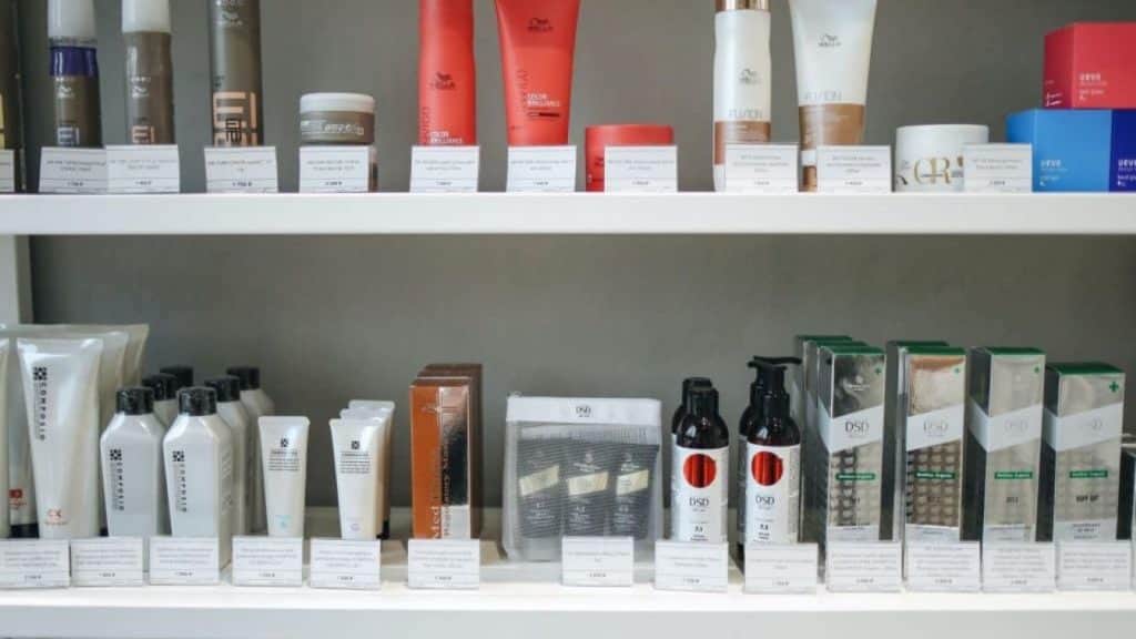
Mismatching tier and material is the second. A $90 moisturizer in a $4 plastic tube tells the customer the brand does not believe its own pricing. The customer responds by not believing it either. Material has to match price or the entire brand reads as unsure.
Copying competitor design is the third. Skincare is a category where standing out is the entire point. A brand that looks like every other brand on the shelf becomes invisible. Differentiation is not optional in skincare. It is the job.
Using cheap materials at premium prices is the fourth. The customer can tell. The body knows. The brand loses trust and the price point gets harder to defend with every customer who picks up the bottle and puts it back down.
Designing for one product instead of a system is the fifth. A skincare brand will launch more SKUs. The packaging needs to extend cleanly to a serum, a cream, a cleanser, a toner, a body line. If the original packaging cannot stretch, every new product becomes a redesign and the brand loses cohesion.
What is the next step in your business?
If your skincare brand is not selling at the rate the formula deserves, the packaging is the first place to look. Not the price. Not the ads. The packaging.
This is what we do at Aventive Studio. Skincare-only branding and packaging design built to do the job: signal premium, win at first impression, perform online, and scale with the brand.
If your packaging is not pulling its weight, see how we work.