Skip to content
Logo Design for a Meal Replacement Shake

About the Brand:

Natrava is a meal replacement shake that helps people eat healthier, meet their nutritional needs, and create daily routines without sacrificing their modern lifestyle. This shake comes in two flavors, vanilla and chocolate.

This video is taken directly from Natrava's website and Aventive Studio does not own copyrights. Visit https://natravahealth.com/ to learn more about this amazing meal replacement shake.

The Challenge:

Natrava was looking for a full branding experience with the goal of launching the business and its signature products. As a startup, they needed everything from a brand plan to complete visuals.

Outcome:

We developed a brand strategy and a long-term plan for attracting Natrava’s ideal customers. During the process we discovered the customer journey, analyzed competitors, developed brand attributes, and created brand taglines. Our team then designed a logo, selected the right colors, and chose fonts. Finally, we went on to design Natrava’s product labels, gusset bags, and boxes.

Scope of the Project:

Brand Strategy
Customer Journey
Visual Identity
Logo Design
Label Design
Gusset Bag Design
Packaging Design
Box Design

Team:

Strategist and Creative Director - Kady Sandel
Brand and Packaging Designer – Ghian Red
Brand Messaging – Kelsey Horton

wellness packaging design for a protein shake company

The Story:

Natrava reached out to Aventive Studio as they were looking to launch their wellness products and they wanted to be ready for their coming business growth. The process started virtually and then our brand strategist and creative director, Kady, met with Natrava’s founders and marketing team. At this time, Kady presented the brand strategy and visuals at a meeting at Aventive’s office in Austin, TX. The whole branding project was completed in 3 months, and it resulted in the successful launch of a new brand package, including logo, labels, packaging design, and overall launch plan.

Logo variations for a health and wellness brand

Brand Discovery & Logo Design:

Aventive Studio’s goal was to develop product visuals that would tell the Natrava story on their own. The whole brand needed to look energetic, simple, premium, trustful, and scientific. For this reason, we combined natural elements, such as the leaf and water drop, for the logo design. A leaf – associated with trees, plants, and flowers – is a symbol of growth, rebirth, and life. These associations are excellent for a logo design, especially for a business that uses natural ingredients. Water represents life and the simplicity of the droplet was an ideal fit for Natrava. The two elements combined, leaf and water drop,  had a natural, perfect resonance for our client’s brand. for Natrava’s label and packaging designs, we focused on pinpointing a healthy and fresh shade of green and a modern, established font.

visual identity - fonts for a health and wellness brand
visual identity and colors for a wellness brand

Label Design:

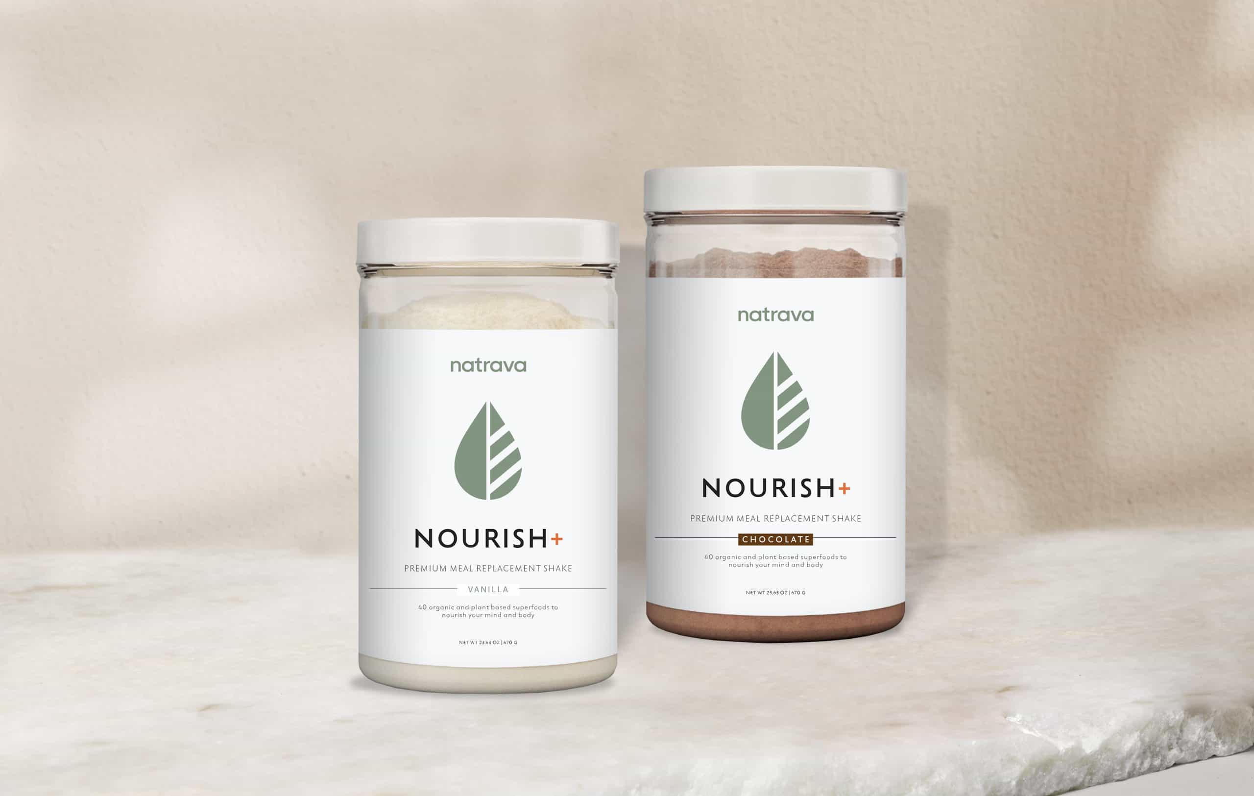
As Natrava is available in two flavors (vanilla and chocolate) under one brand umbrella, we wanted to design a flexible and minimalistic appearance. We wanted the brand to be memorable and easily recognized. The ideal customer identified for Natrava product purchases is someone who cares about conscientious eating, simple meals, and having a healthy lifestyle, so these components were primary in our visuals and label designs. Trustworthy, simple, and healthy!

premium packaging design for a wellness brand
Protein Powder labels and packaging design

Packaging Design:

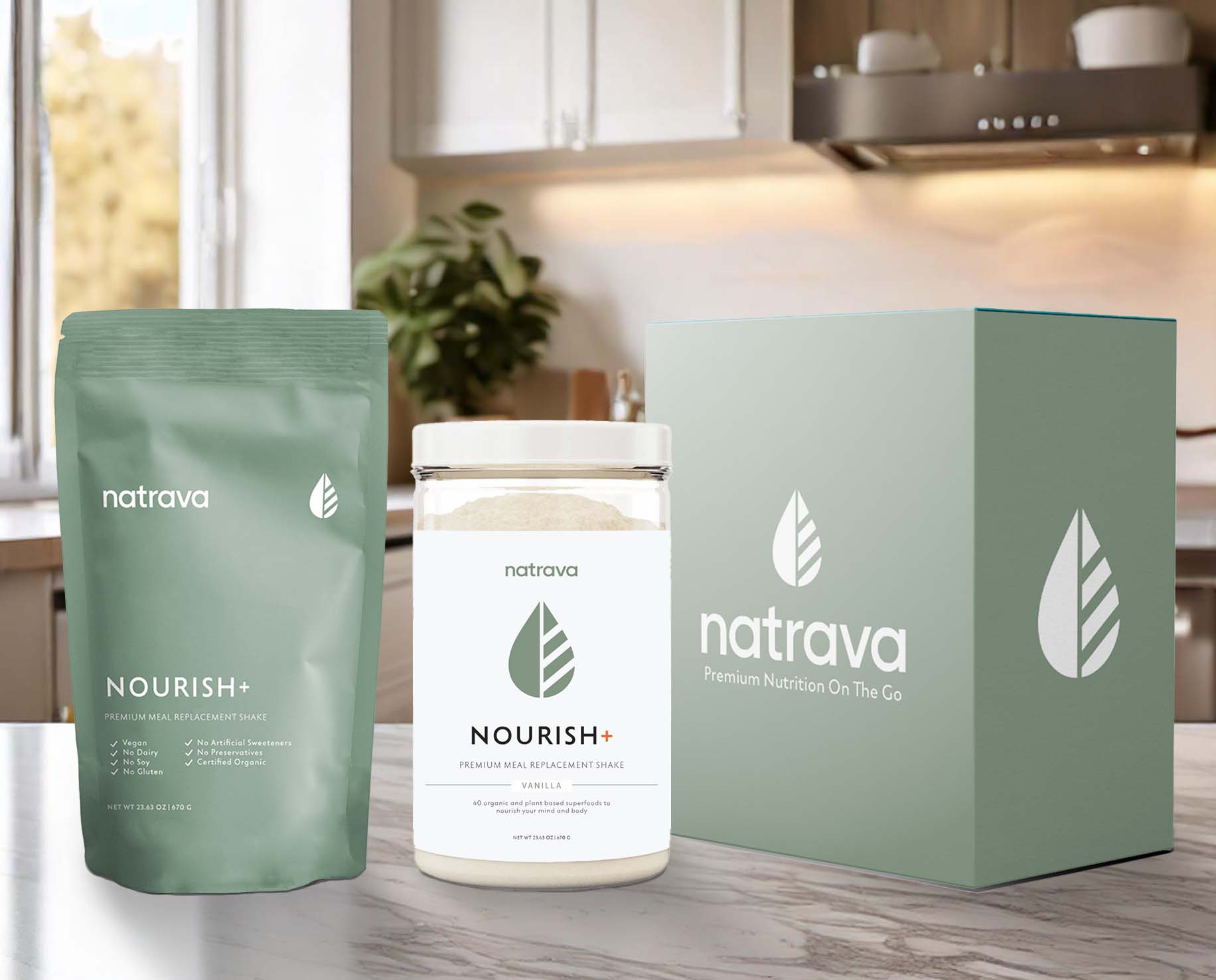
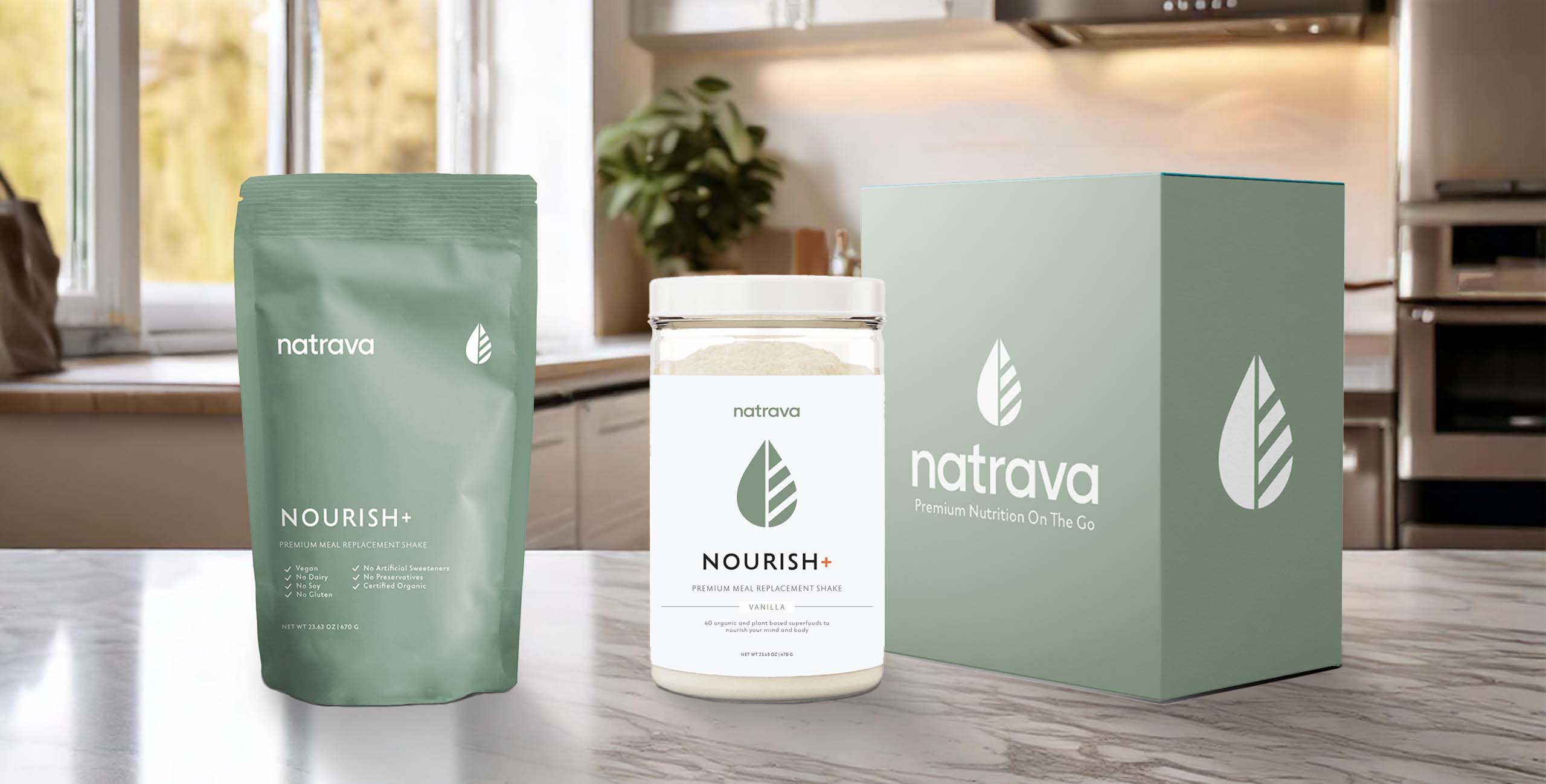
As our product label designs were mostly white with accent colors (green and orange with white or brown, depending on the flavor), we wanted to design Natrava’s gusset bags and boxes to stand out on their own. We wanted to create excitement in the customer, as they opened a bag/box to see what’s inside. Based on the psychology of colors, the color green is associated with growth and vitality, as well as with new life and renewal --- and our package designs truly reflect these elements! In additional their association with nature, health, and healing, our color selection also evokes emotions related to balance, harmony, and a sense of calm. Our green packaging design was a sales success for both Natrava products.

Logo icon for a meal replacement shake
white logo design presentation

Ready to bring your brand to life?

Scroll To Top